The World Exposition, better known as the World Expo, is an annual gathering that features humanity’s greatest achievements in science, technology, and international innovation. This year, the 2020 Expo was scheduled to take place in Dubai, United Arab Emirates. But it has been postponed to October 2021, due to the COVID-19 pandemic.
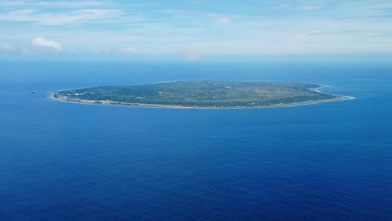
The 2025 World Expo, however, will be held in Japan’s Kansai region – specifically in Osaka at Yumeshima, a man-made island. The name translates to “Dream Island”. It’ll be the first time Osaka has hosted the global event since 1970. And as the home of an interconnected skyscraper–Umeda Sky Building–Osaka seems to be the perfect place to celebrate innovation.
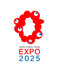
Here’s the official logo for the momentous occasion.
For context, here was the shortlist of logos to choose from.

The winning logo was created by Team Inari, led by designer Shimada Tamotsu. The googly-eyed wonder is meant to express “the brilliance of life”. Designed to resemble a cell nucleus, and also the city of Osaka itself, Shimada and his team’s goal was to create something “original and impactful” like Osaka’s Sun Tower, which was the centerpiece of the 1970 World Expo.
Though the sentiment was largely understood, the logo has been met with amused reactions by Japanese netizens, which led to a trending topic on Twitter, “#コロシテ“, (koroshite) or “Kill me.” The katakana serves as a bold font in this case, reflecting the body-horror existence of the amorphous logo.
Related logos include “#コロシテ君” or “#コロシテくん” (Koroshite-kun), roughly translating to “Mr. Kill Me”.
Aside from shock and awe, Japanese netizens created many memes that parody the logo’s grotesque appearance. Comparisons to existing icons include Tohato Caramel Corn, and pon de ring donuts, with Koroshite-kun existing as a mash-up of the two.
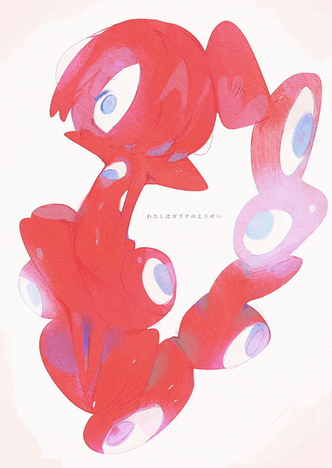
Some have likened it to guarana berries, which resemble white eyeballs with fleshy red eyelids.
As promised, here are some hot takes on Koroshite-kun. All of the images are linked directly back to their source.
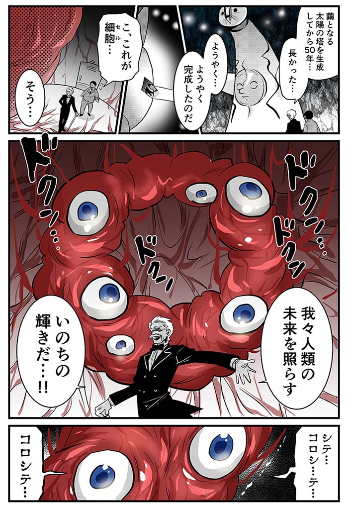
First up, we have manga artist Mori Yukie who wanted to do a “sci-fi twist” on the Kansai Expo 2025 logo. Here we see two people approach the Osaka Sun Tower, where within in its hollow interior, another project has gone underway. But finally….finally after a long 50 years, a new creation arises, a fleshy, pulsating “brilliance of life!”
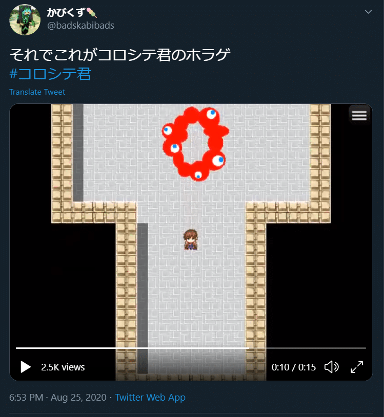
Next we have @badskabibads, who created a free-to-play video game where Koroshite-kun is a monster trapped in a tower that you must escape. It directly references 8-bit dungeon crawlers.
And finally, @0620Oyu, decided to take a simpler route, and just replaced all the eyes with “pien” emojis–also known as the “puppy-dog eyes”. They did it because “the original logo felt too monster-like”.
Though some may deem the logo to be an unusual choice, there’s no doubt the design has a viral quality to it. Be on the lookout for Koroshite-kun paraphernalia about five years from now.